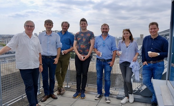
Group
Current PhDs
- Samuel John Gardiner-banks (Octobre 2025-onwards)
- Impact of CO2 mineralization on the poromechanical properties of basalt.
- Guadalupe Flores (Octobre 2024-onwards)
- Seismic attenuation caused by squirt flow in fluid-saturated rocks.
- PhD between UNIL (advisor Beatriz Quintal ) and ENS
- Maxime Guillou (Octobre 2024-onwards)
- The becoming of carbonate aquifers under shallow burial conditions : influence of the early diagenesis on the evolution of physical and mechanical properties, spatialization and modeling of geological processes
- PhD between CYU (Bertrand Maillot and Jean Baptiste Regnet) and ENS
- Emile Gros (Octobre 2023-onwards)
- Recherche multidisciplinaire pour la caractérisation du fonctionnement hydrogéologique des aquifères volcaniques de la Martinique : édifice volcanique du Morne Jacob.
- Collaboration with Sophie Violette (ENS) and Benoit Vittecoq (BRGM)
- Julien Doucot (Octobre 2022-onwards)
- La diagenèse précoce des sédiments carbonatés au laboratoire : approche expérimentale des processus géologiques et leur rôle sur les propriétés réservoirs.
- PhD between CYU (Jean Baptiste Regnet and Philippe Robion) and ENS
Former PhD Students
- Gang Lin (defended the 15 of September 2025)
- Théo Briolet (defended the 24 of March 2025)
- Augustin Thomas (defended the 08 of March 2024)
- Ariel Gallagher (defended the 20 of June 2022)
- Sun Chao (defended the 14 december 2020)
- Hanjun Yin (defended the 6 June 2020)
- Cedric Bailly (defended the 19 december 2019)
- Multi-scale geological and geophysical characterization of lacustrine carbonates of Samos Island (Upper Miocene, Greece) – Relationship between facies, diagenesis and elastic properties
- Now Assistant Professor at University Paris Saclay
- Li Zhi (defended the 22 of March 2019)
- Physical properties of a thermally cracked andesite and fluid-injection induced rupture at laboratory scale.
- Now at the China University of Geosciences
- Jan Borgomano (defended the 24 of January 2018)
- Dispersion of the elastic moduli of saturated carbonate rocks : experimental study and modelisation.
- Now Researcher at Total R&D
- Lucas Pimienta (defended in 2015)
- Aurélien Nicolas (defended in 2015)
- Mechanical behavior of low-porous carbonates : experimental study and micromechanical modeling.
- Now Bureau Veritas Marine & Offshore - Structure research team
- Céline Mallet (defended in 2014)
- Audrey Ougier-Simonin (defended in 2011)
- Mechanical and transport properties of cracked glasses.
- Now Researcher at the British Geological Survey
- Mathilde Adelinet (defended in 2010)
- From field to laboratory, study of the elastic properties of basalt.
- Now Assitant Professor at IFP School


Ariel PhD's defense + Cedric PhD's defense.